StateGlyph
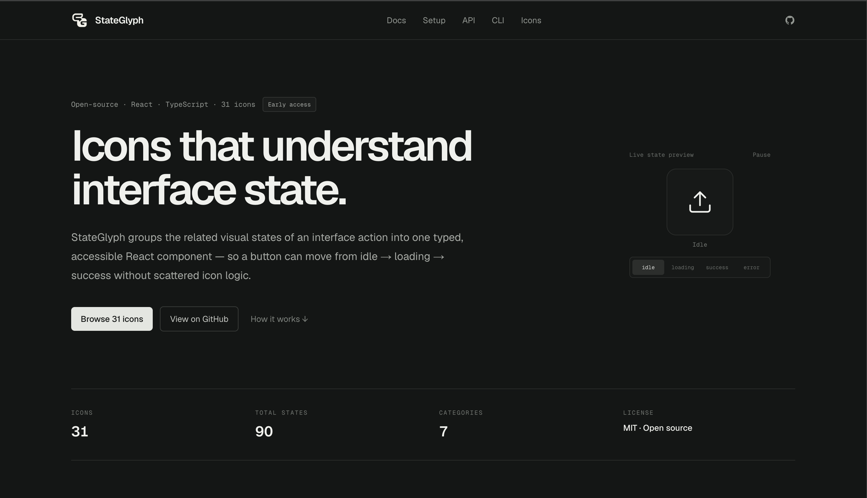
An icon system that understands interface state.
01 / The idea
Overview
An open-source React and TypeScript icon system for idle, loading, success, warning, error, and other interface states, with accessible labels, animated transitions, documentation, and a copy-and-own CLI.
StateGlyph makes interface feedback easier to design and maintain by grouping related visual states behind one typed React component. Actions can move from idle or loading to success, warning, error, or another outcome without wiring separate icon imports throughout the UI. The system brings together framework-independent definitions, React renderers, optional animated transitions, accessibility guidance, per-icon documentation, and a copy-and-own CLI.
02 / Under the hood
Built with
Frontend
Tooling & documentation
Technologies: React · TypeScript · Lucide · Next.js · CLI
03 / In the details
Core features
- 01
Typed component APIs that make every supported state discoverable and prevent unsupported state values
- 02
State-aware glyphs for asynchronous actions, feedback, navigation, media controls, forms, commerce, and notifications
- 03
Optional crossfade, scale, rotation, slide, and morph transitions with loading animations and reduced-motion fallbacks
- 04
Decorative defaults plus semantic labels and predictable focus behavior when an icon communicates meaningful status
- 05
Per-icon documentation with state descriptions, interactive previews, accessibility notes, and ready-to-adapt usage examples
- 06
A copy-and-own CLI that places editable TypeScript components directly inside an application when package imports are not preferred
04 / A closer look
Screens
01 / 01 Interface preview